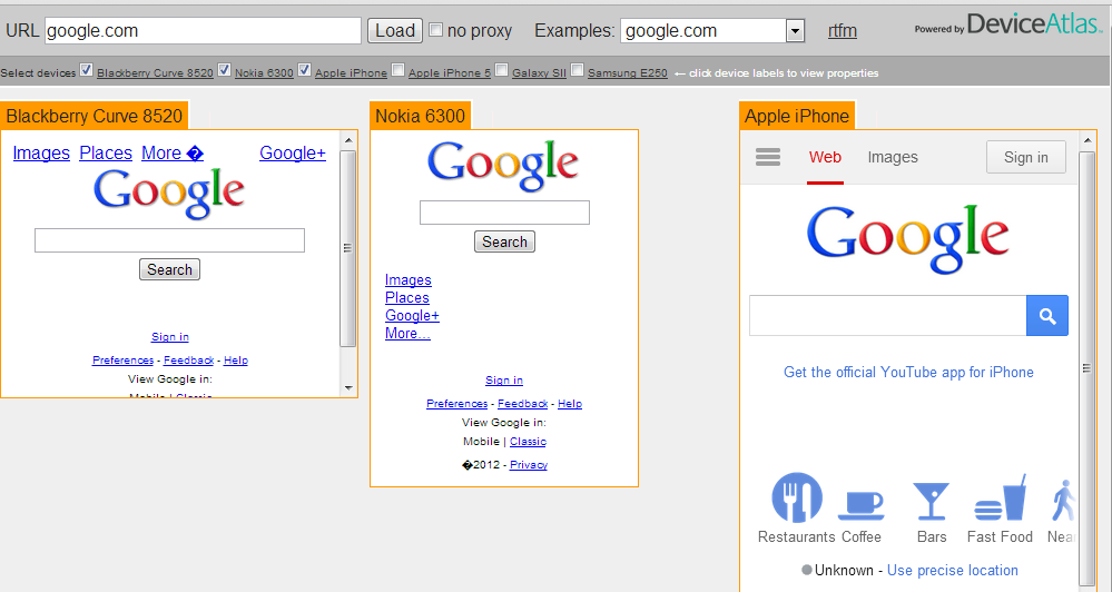
If you are involved in developing mobile web content, you’ll know that testing your work on real devices takes a lot of time. We’ve built the Prism tool to give you a way to quickly view how a site looks in up to 6 different popular devices. This gives you the ability to see at a glance how your site is being rendered on various devices and compare the page sizes and breakdowns across the different versions of given page. All without having to switch between various UAs with UA switchers.
You can also use Prism as a research tool to understand how bigger sites are adapting their content for different devices.Select a site from the pre-populated drop-down list to see how the site looks in different devices. For more on how Prism works, see the original blog piece published over on Mobiforge.


